Tuesday, January 7, 2014

Spider-Man

With "Sticky Situation," the first thought that popped into my head was a guy sticking to a wall. When I think of a guy sticking to a wall, I think of Spider-Man. For the repetition, it was a no-brainer as NYC brick buildings are a dime a dozen. So to be able to paint him, I started with a pencil sketch of the scene.

Following the sketch on canvas, I painted the background buildings and street below. After the background was completed, the building and window Spidey is crawling on is painted. Finally, Spider-Man's blue and red tights were painted, after putting the shine on his suit, presto!

Thursday, January 2, 2014

Melting Hand


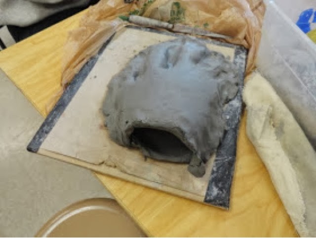
A melting hand on a log is pretty questionable sight, wouldn't you agree? In addition to being freaky, it also has proportion! This was done with a clay mold, seen below:

This is how the proportion was accomplished, after the mold formed, it was filled with hot melted wax, and set out to dry over night. After this, the wax hand was cut, and placed on the log and cloth. It was then melted with a heat gun and you have the end result! 

Che "Commie" Guevara

A potrait of a communist might be somewhat questionable, but the end result is really cool. This portrait is of Che Guevara, a communist revolutionary. We used layers of plaster to make a semi-3D face. Black ink was used to make the outline, while red paint was used to make the background. The splotches of "blood" were made by red food coloring. This all combines for a pretty cool end result!

Thursday, October 3, 2013

Up Close and Personal

This is a drawing of soldier saying his goodbyes to his son before he heads off to war. The idea of "Up Close and Personal" came from the idea of a man spending some personal time with his son before or after he goes off to war. The emphasis was made by softening the lines and shading of the train in the background, and making the man and his son bolder. Pencil was chosen to make the picture resemble a black-and-white photo from the 1940's. Emotion was used to help the impact of this drawing, since people can relate to having a loved one going off to war, they can understand the emotion the boy is feeling just by looking at him and know the feeling the piece evokes from their own experience.

Tuesday, September 10, 2013

What's The Point?


The theme of this piece was "What's The Point?" The point is the compass, which will point in any direction. To medium used was a combination of charcoal pencils and black pastels. The charcoal pencils were used to draw outlines, and to emphasize certain objects, such as the compass, the mountains in the background, along with the railing and the hand. The pastel was used for shading in order to create shadows used to contrast the bright areas to the dark areas. The pastel was rubbed out on the paper to create areas that were darker or lighter than others. The reason pastel was chosen over charcoal was because it blends best, and creates better shadows. The result is smoother and more believable shadows and surfaces.

Thursday, May 30, 2013

Pastel Still Life- Soda Love

The composition of this piece was a cool color scheme, which was chosen based on the colors of the cans as well as the colors of the bottle. Thumbnail sketches were used to help decide what point of view to use, as well as the position of the cans and bottle. Thumbnail sketches are small sketches that help determine what kind of viewpoint and angle you want to use for the artwork. The viewfinder helped decide on the composition by showing what the cans and bottle were like from a certain angle. The cans and bottle were made three-dimensional using shading and perspectibe, which make them appear as seperate objects that had space between them. The lightsource was created by having a lighter value in the background and having the value become darker as the space became more distant from the lightsource.

Ceramics- Shallow Bowl


The medium of this project was a shallow bowl meant to hold fruits or chips. This bowl has a large size compared to the other pieces made. The design element the is stressed most is the curving of the bowl along with the design at the center. The technique that was used was to use another bowl as a template, sculpt the clay on it, and remove it once dry. The bowl's purpose is to serve as a fruitbowl or a bowl for chips. The design in the center was based on French symbols and paintings. The symbol was first scratched in when the bowl was removed from the template, then red clay was painted in so it would show up better. The red clay was painted before the bowl was placed in the kiln for the first time. If I could repeat this project and change the bowl in any way, I would make the center design more neat, and I would make the edges more smooth. This project taught me that patience is needed for this kind of work, and you must be careful and thorough when making pottery or clay sculptures of anykind.