Bottle
This bottle was first done by doing a white outline and shading with a white colored pencil. After the white sketch against the black paper was completed, the bottle was colored in. Using different shades of green, the bottle was made more lifelike. When that was completed, the highlights were made by putting intense streaks of white against the bottle where the light was shining, leading to the final result above.

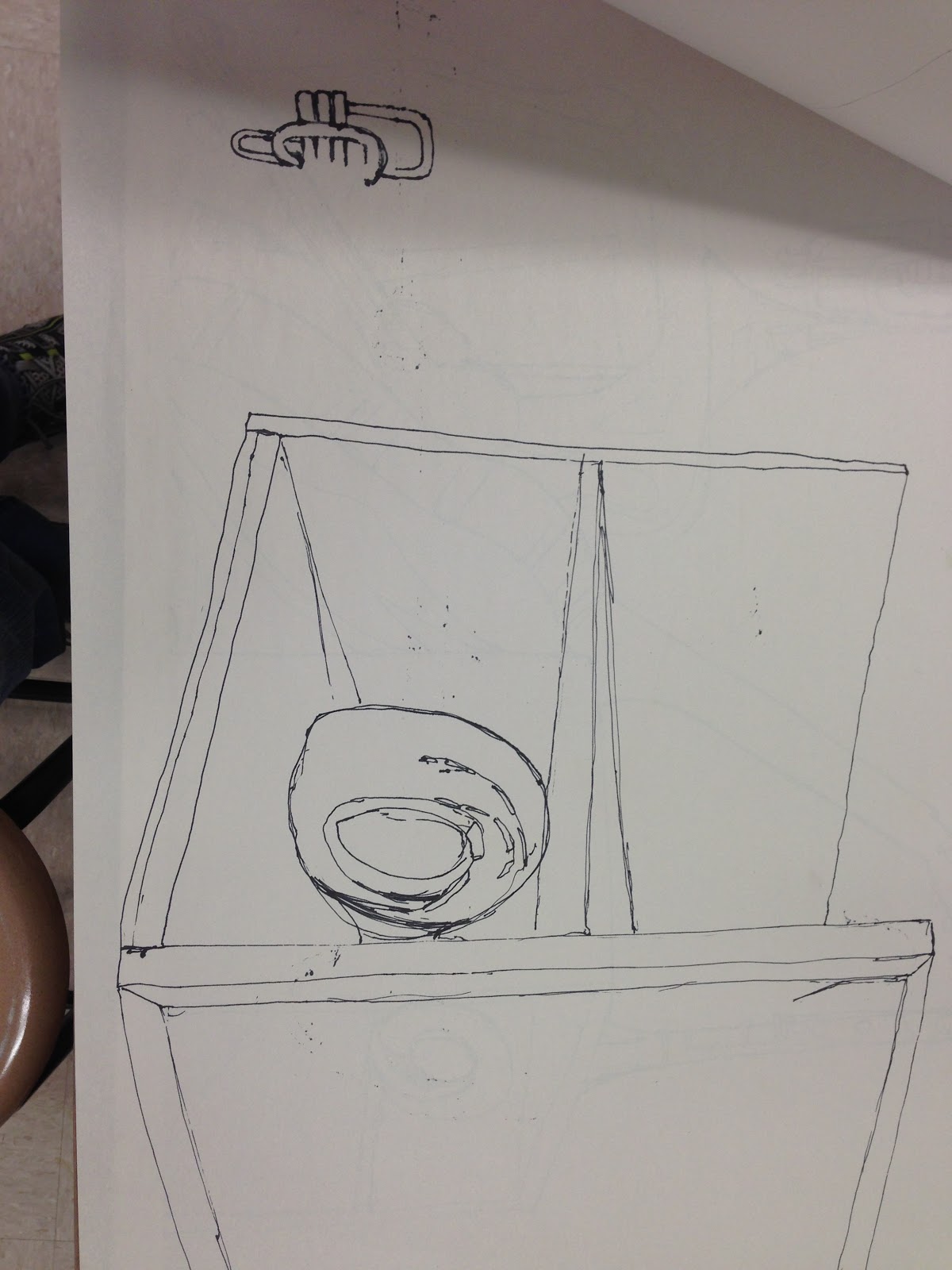
These drawings were done with a pen and were done as a contour drawing. Contour drawings mean that the pen cannot be lifted from the paper, this can give a smooth look once done correctly. The way I did these drawings was I did the outline first, then filled the details after. This order helped make the proportions easier, especially with the instruments.


Candy
A quick glance will tell you that these are only two separate drawings of peppermints. While they are of the same object, the way they were done were very different. The smoother-looking peppermint was done in color pencils, which are better for fine details. The rougher one was done in pastels. The rough appearance was a result of me not rubbing in the pastel, as most pastel pictures are. With this, I found the color pencils easier to use, as they are less messy and better-suited to do fine details.


Sky Diving!
I have always wondered what it would be like to free fall towards the Earth. So with a theme on Points of View, I figured it would be neat to try to envision skydiving on paper. Of course, I wouldn't fall alone, so I put three other people with me. This presented some unique challenges, such as the shading of the ocean below, and how would the body react to draft and wind while falling? I think that these obstacles have been overcome with good results. In addition to that, I had to be sure the hands looked alright. I personally think it turned it out good!

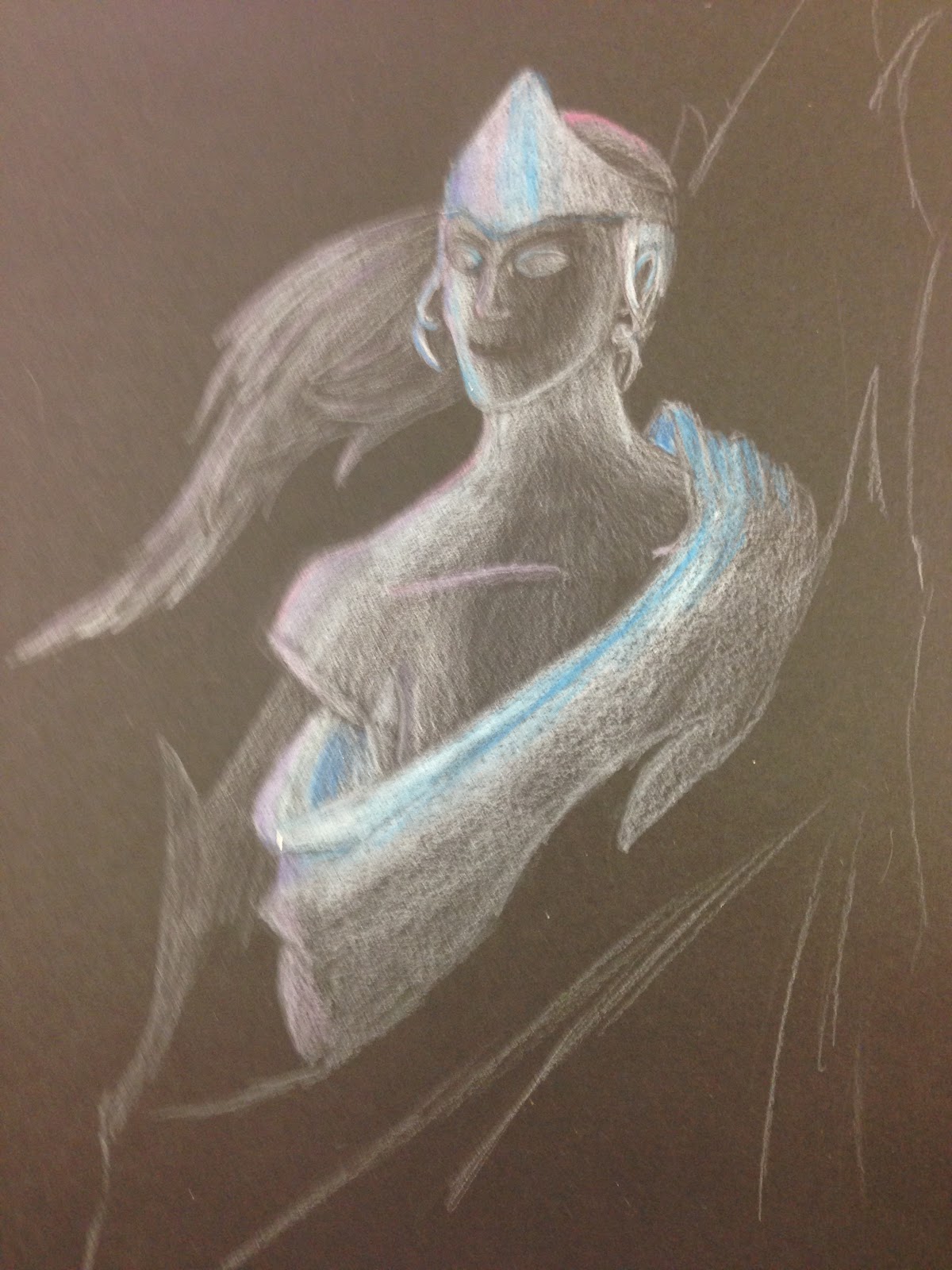
The Ice Lady
Ice statutes don't last forever, but they look really cool when they are around. For the opacity project, I decided to do this because an ice statute allows for a variety of ideas, and no matter what it depicts, it always has similar transparency and colors as others. Some of the issues that came with this involved the transparency of the statute and the light on it. What kinds of colors would look good on it? How transparent is it? I meant for it to be more transparent at first, but this was more difficult than I thought. I made it less transparent, and to help the picture to adjust to it I increased the variety of the colors on areas that were previously meant to be transparent. In retrospect, I wish that I had thought the transparency part more thoroughly, and that I could have planned it more carefully.. The colors seemed to work well, but they would have looked better if they could act as the highlights for areas that are hit by light. The progression of this project can be seen below.


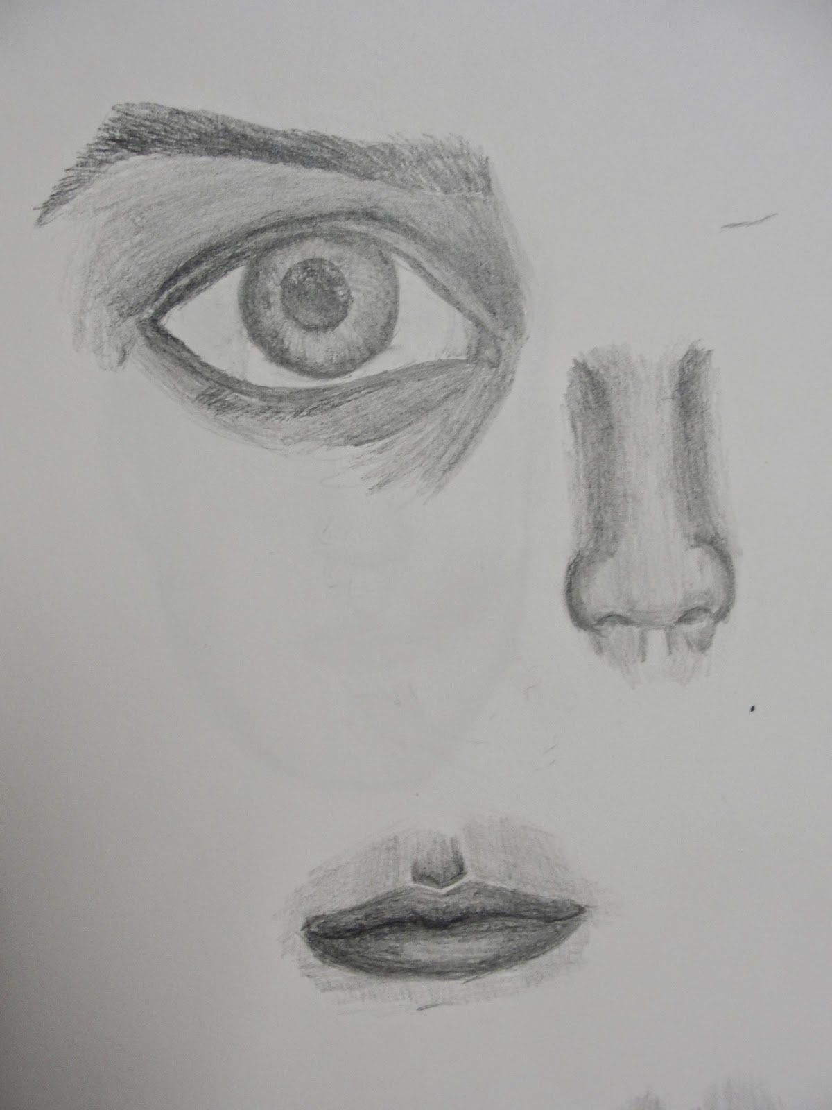
Made by placing a skull underneath tracing paper, and then sketching the face on top.

Killer Robot


These are a few of the practice drawings I did to practice for this project. The flesh color with prismacolor was something that I had never done before and was a great challenge. It required multiple colors to make it seem realistic. As some parts accidentally became too dark, I decided to make this an opportunity to show how the fleshy part of the face came off. It made the perfect opportunity to show burn marks. In the end, I wish I had more time to make the skin colors smoother, and that the eyes had been more detailed, but I feel this was a great way to practice with prismacolor.


The three pictures on top were done with iPads, the rest are done with either charcoal or pencil.
Skeleton
A drawing of a skeleton that was done over a few days.
Figures are a very difficult thing to draw for most people. This piece presented a good challenge to draw a figure on a very large piece of paper while keeping the proportions right. To make this easy on the model, I drew a gesture drawing in pencil, and then filled in basic details. Next, I decided to try something new. I decided to use the charcoal pencils, which allow for darker lines and better shading. The end result was satisfactory for me, but I feel that some things could be improved. I feel the hands are too small, and the arms and legs are too long. This was a good lesson though, as it challenged me to work a lot bigger than I am used to and to work with the model.

Scratchboard Wizard
Scratchboards allow for a different, more interesting way of shading and highlighting. To me, this meant that more dramatic highlighting was allowed, and a glowing orb seemed perfect for this. Before this project, I had never even heard of a scratchboard. Once I saw what kind of pictures could be made, I decided to start my final version. In the end, I wish I had been more careful in working on the texture in the clothing, and that the face had been darker. But otherwise, I felt that it looked great, the light on the hands was the best part in my opinion.


No comments:
Post a Comment